Published June 3, 2012
The StudentAid BC website has been completely rebuilt to deliver the information you're looking for, wherever you need it.
The new site is a direct response to the feedback we collected from students. It offers many enhancements to help you find information quickly:
Improved Navigation
What you said:
Anything that makes it easier to navigate all the items...
Add a login bar on the main page at the top...

What we did:
The website has a been reorganized to make information, like scholarships and repayment programs, much easier to find.
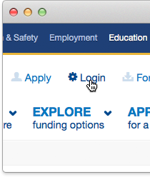
Plus at the top of each page you'll find quick links to popular self-serve options like Apply and Login.
Social media channels
What you said:
Integrate with social networking...

What we did:
You can now follow @StudentAidBC on Twitter for important tips, notices and information.
This latest news section is also brand new. We'll post here when there's important information and new programs.
Better content
What you said:
The website could be less crowded, with less text. It is hard to find anything there, hard to navigate.
I think that the website should use plain language.

What we did:
With more intuitive menus, simplified navigation, you will still find all the relevant information you need to know before you apply for student loans and grants.
But we didn't stop there! We re-wrote every inch of content so instructions are easier to understand, forms you need are right up front, and you can drill down for more details.